Click to enable dark mode

Katelyn McDonald
UX Researcher

Background
Our team was tasked to create an app to solve a problem in a person's everyday life. We had a three week timeline to create a mobile prototype and code a mock-up.
We chose Balance, a mobile calendar application designed to create balance and harmony within one’s life by tracking patterns, goals, and life events all in one place.
Balance
Mobile App
Tools used
Pen and Paper
Miro
Figma
Visual Studio Code
My Role
UX Researcher
Lead Interviewer
Competitor Analysis
Feature Prioritization Matrix
Wireframe
Prototype
User Testing
The Problem
Most health and lifestyle apps serve specific, niche purposes. As a result, if you want to establish and build healthier habits, you have to use multiple applications that do not integrate with each other
The Solution
We created Balance, an app designed to sync with a daily calendar and incorporate healthy lifestyle features such as goal setting, habit tracking, and journaling.
Step 1: User Research
I created a survey to assess what potential users currently use for a calendar and other lifestyle apps. We generated 75 responses from the survey. The results showed that there is interest in an application that could integrate daily calendar usage with habit tracking and goal setting.
Key Takeaways:
97% of people use a calendar in some capacity and 75% of those people use one daily
50% of people track their habits including: water intake, workouts, sleep, and screen time
94% of respondents reported they would like an application to better track their daily habits
83% of people set goals for themselves. However, 40% stated they had no way to write down goals.
Feature Prioritization
I organized these research findings into a prioritization matrix where features were ranked based on how much of an impact they would likely have on the user and how complicated the feature would be to integrate into the app. This gave a framework for what to focus on and make a priority moving forward.

Competitor Analysis
I also conducted a competitor analysis to look at existing calendar apps and habit tracking apps. Their strengths and weaknesses were analyzed. Our team then tried to figure out how our app could fit into the market.
Google Calendar
Only a calendar and user must have an account. Not many noteworthy features beyond a daily calendar
Fantastical
Easy to use calendar. Additional features such as weather tracking. Can only be used with Mac products
Focus To-do
Timer and task management app.Makes organized to-do lists. Very complicated onboarding.
Daylio
Habit tracking app. Very customizable and easy to navigate. Most features behind a paywall.
User Persona
Our team created a User Persona to identify what we thought a typical user might look like based on the research we collected.
Meet Julie, a 28 year old student and waitress who is struggling to balance school, work, and staying physically and mentally healthy. She wants an easy, customizable way to track her schedule, healthy patterns, and short and long term goals.

Step 2: Ideation & Definition
Problem Statement
Our design team observed that calendar applications are niche and specific to one activity or habit. The design team is in the process of creating an application that encompasses many of these niche features. How might we design an application that includes features such as a calendar, pattern tracker, and goal setting in an easy, compact, and personable format?
Storyboard
Our team created a storyboard to show how Kayla, our user persona, could solve her wants and goals of getting organized by having all her activities and habits in one place.

User Flow
I created a user flow to illustrate how a user might proceed through our mobile application. This step-by-step diagram shows what we would imagine a typical path through the app might look like and can show where users might hit frustrations and dead ends.

Step 3: Wireframing & Testing
Low Fidelity Prototypes
Our team created wireframes to show a basic outline of how we thought the onboarding process and main pages from the user flow should be laid out.


User Testing
We had 5 people go through our prototype and give their impressions. Key takeaways were that the app was clean and comfortable. One important thing we noted during testing was that users preferred the term ‘patterns’ as opposed to ‘habits’ for our tracking feature so that was a major focus of iteration. I also found that a small interaction we could add into the patterns section was to have a streak feature so users would be incentivized to return to the app daily.

Step 4: Iteration
Style Guide
Our team created a style guide to give direction and consistency to the app. We picked a soft blue as the primary color after doing some research on the psychology of color. Blue is considered the dopamine or feel-good color. We added a set of secondary colors to coordinate with the blue. We wanted bright and distinctive colors but still in a calming palette. Next, we defined the typography, button, and logo usage. Finally, we created icons and illustrations to use in the app.


Iteration & Hi-fidelity Prototypes
The directions of the style guide were applied to our low-fidelity prototype to create a high-fidelity prototype. The key takeaways from user testing were also applied. Users indicated that they wanted more of the features built out and incorporate some additional things such as a timer and weather app.


Clickable Prototypes
The final step was our team made the high fidelity prototypes clickable and we had a final round of user tests to make sure users could navigate the new webpage easily.
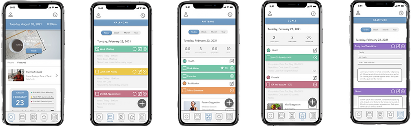
Mobile Prototype
Conclusion
The goal of this project was to create a mobile calendar application deigned to create balance and harmony within one’s life by tracking patterns, goals, and life events in one place.
In conclusion, our team created a daily calendar app for mobile phones called Balance. The app was designed to integrate a daily calendar with additional features to help a person track their goals and habits. We accomplished this by establishing the want and need for this type of application through user research. We then defined exactly what a user was looking for by establishing a user persona and storyboard. The team then developed wireframes and incorporated a style guide to project a calming feeling. User testing was conducted to collect feedback and the prototype was iterated on to create a final product.
If you are interested in more in-depth information about this project or would like to see the full, clickable prototype, please feel free to reach out to me.
