Click to enable dark mode

Katelyn McDonald
UX Researcher

Background
Our team was tasked to develop an app to help young children how to identify big emotions. We had a three week timeline to create a clickable high-fidelity prototype.
The goal of this project was to find a fun way to help kids identify big emotions. We created an app that works by having kids color an image with a color that is assigned to an emotion.
BuzzyBee:
Tablet App
Tools used
Pen and Paper
Miro
Adobe XD
My Role
UX Researcher
Competitor Analysis
User Flow/Site Map
Wireframe
Prototype
User Testing
The Problem
We realized that parents to young kids want a way to teach their children how to identify and talk about the emotions a child feels on a daily basis but it can be difficult to do since children don't have the vocabulary to vocalize how they are feeling.
The Solution
We created BUZZYBEE to teach kids how to recognize their emotions by creating coloring activities and to give parents tools to communicate with their child.


Step 1: User Research
Proto-persona
Our team started by identifying potential users and developing a rough outline of who would be using our app and why they might find it useful. We quickly discovered we had 2 core audiences, a parent demographic and a child demographic.


Interviews
For this project we conducted 8 interviews. 4 with children aged 3-5 and 4 with their parents. We wanted to collect insights about how children experience big emotions, how parents deal with children experiencing big emotions, and how parents incorporate technology into their child's life.
Children tend to experience and react to a big emotion at least once a day
Parents are continually asking how they can help or assist their child.
Most families allow their children to use technology with rules about screen time
Children use an iPad more often than a phone or a computer.
User Persona
We refined our ideas about what a typical user of the app may look like based on the research collected during the interview phase and created a user persona .

Janet wants to better understand the emotions her child is experiencing
Janet feels her family is in survival mode and doesn't know how to balance her emotions and her child's emotions
Janet has experience with depression and wants to give her children the tools they need to talk about emotions
Step 2: Ideation & Definition
Problem Statement
Emotions are a valuable internal feedback system that motivates, energizes, directs, informs and connects us. How might we create a product that helps parents with young children understand their child’s emotions by providing communication tools for the child to use that help identify patterns in their mood or behavior?
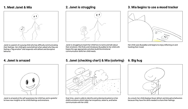
Storyboard
Our team created a storyboard to show how Janet, our user persona, could solve her wants and goals of finding a way to help her child identify and recognize big emotions..
Competitor Analysis
I conducted an in-depth competitor analysis of apps currently available. There were apps that tracked moods and identified emotions and there were apps designed for kids that helped them deal with their feelings but there wasn’t an app that both engaged kids and helped them identify emotions and tracked emotions over a long period of time.

Step 3: Wireframing & Testing
User Flow
Based on user research, our problem statement, and competitor analysis, we developed a user flow to show an optimized way for a potential user to navigate the app. The goal was to be able to diagram the onboarding process, setting up a user profile, and completing a coloring activity in the app.


Low Fidelity Prototypes
Our team created individual sketches and digital wireframes to show a basic outline of how we thought the app should be laid out. We used elements from each individual design to create a low-fidelity prototype.


User Testing
In this phase, I conducted 5 user tests to check the functionality of wireframes I had made clickable. The goal was to see if the users could successfully follow our onboarding process, create a profile for their child, go through the coloring activity, and access the parent portal.
Key Takeaways:
Improve the user flow
Clarify the language used on app
Make features more accessible on all pages
Step 4: Iteration
Color Scheme
It was important to our group that the colors used in the app design were bold and bright. Based off of user research, we knew children had short attention spans so to help create engagement, we wanted lots of bright color to draw the eye. Additionally, we wanted to create a mascot to help kids navigate through the coloring activity.


Iteration & Hi-fidelity Prototypes
During our interviews, we observed that most parents allow their young children to use electronics in some capacity. However, they primarily allowed their kids to use tablets instead of mobile phones. This led our team to revise and iterate our original plan of designing a mobile app and instead focus on designing an app for a tablet.
Mobile Wireframe

Tablet Wireframe

Clickable Prototypes
In the final steps our team made a high fidelity prototype. We made it clickable and added some animations to make it engaging and fun to use. Finally, we had a final round of user tests to make sure users could navigate the app easily.


Conclusion
BuzzyBee was an app designed for use on a tablet and was created with the hope of helping parents and kids better understand big emotions.
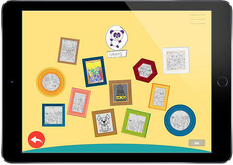
Our team applied a bright color scheme, lots of fun, organic designs and shapes, and an adorable bee mascot who guides kids through their daily activity. The app shows the child a coloring page. The drawing is divided into sections (1 for each day of the month). Kids are asked to identify their mood each day and are assigned a color. They color a section of the drawing with that color. At the end of the month, they are rewarded with a piece of art that they created with their feelings and emotions.
If you are interested in more in-depth information about this project or would like to see the full, clickable prototype, please feel free to reach out to me.
