Click to enable dark mode

Katelyn McDonald
UX Researcher
Step 1: Discovery Phase
User Research
Stakeholder Interview
I organized an interview with the Executive Director at "Gifts for Seniors". The goal was to establish the needs and frustrations the organization was facing and find out what they wanted highlighted on their website.
Methodology
I conducted the interview via Zoom and it lasted for 30 minutes. The conversation was recorded and a notetaker was present to ensure all information was collected. Open ended questions were asked to establish the goals and parameters of the project. Sample questions include:

Results
I used content analysis, a qualitative data analysis technique, to identify themes, patterns, and relationships in the conversation. I then organized the themes and ideas into the following categories to provide a framework to refer back to during the design process.

User Surveys
I chose a survey method as the primary source of user research. This techniques was chosen because it was an easy way to determine why a user visits a website. The results of a survey are easy to quantify and present to stakeholders.
Methodology
I created the survey using Google Forms. This was chosen for its ease of use and ability to be distributed in multiple formats. Categories of questions included demographics, previous volunteering experience, and important features in a website for volunteers. Some example questions include:


I distributed the survey in 2 ways. First, I emailed the survey to current volunteers with Gifts for Seniors via their organization's email. This was done to collect data on the current volunteers of the organization. Additionally, I posted the survey on Facebook as a way to gather the opinions of potential volunteers.
Results
I collected results from 43 users.
I used basic statistical analysis techniques to measure the results of the survey. Techniques include graphs, averages, range, variance, and standard deviance.
The average volunteer with the organization was female, 50 years old, and teacher was the most common profession.

This chart shows that most users volunteer a few times a year.

I found that users would have a variety of ways they would like to volunteer but a majority of people would like to volunteer their time, helping out in person.

This chart shows what users find important in a website for volunteering. The top 3 most important features are: The mission statement of the organization, an easy way to find volunteering opportunities, and highlighting stories about how the organization impacts the community.
User Persona
I used the results of the survey and stakeholder interview to create a user persona. Data showed 70% of our users were females, the average age was 50 years old, and the most common profession was an educator. Users from the survey also wanted to volunteer their time in person. The stakeholder interview showed a strong desire to care for others and a feeling of isolation was felt during the COVID pandemic.
Meet Julie, a 50 year old teacher who has been feeling the effects of isolation during COVID and wants to use her free time to help others who might be feeling the same.

Step 2: Definition Phase
Card Sorting
A key takeaway from my stakeholder interview showed a strong desire for a website with a simplified navigation for the Gifts for Seniors website. I used a card sorting techniques to have 3 users group items on the existing website into categories that make sense to them. My team was able to use this data to create a new site map.

Competitor Analysis
My user research showed what potential volunteers want in a website is easy access to relevant information, simple navigation, and a clear mission statement of the organization. I did a competitor analysis to look at 4 other similar local charities to assess how well those sites met those needs.

Step 3: Development Phase
User Flow
Based on user research, card sorting results, and competitor analysis, I developed a user flow to show an optimized way for a potential user to navigate the website. The end goal was to successfully sign up a potential volunteer with Gifts for Seniors.

Wireframes
When I created a wireframe for the new homepage, I used the results from the survey to inform the design choices.

Guerilla Testing
I used a guerilla testing technique to get first impression reactions from 4 users. I asked for a couple things they both liked and disliked about the layout of the wireframes.

Results from guerilla testing showed that the navigation seemed easy and calls to action were very visible. Additionally, users thought there wasn't enough space for photos and that the homepage layout needed to be more user friendly
Prototypes
Based on the feedback from the guerilla testing, I made suggestions to make the homepage easier to navigate, make the calls to action very prominent, and add more photos. The designers on the team took those suggestions and applied the style guide they had created and we created a high fidelity prototype.
Remote Usability Testing
I conducted 5 remote usability tests with our high fidelity prototype. I gave the users a goal to explore the site and try and sign up for a volunteering event with the organization. Additionally, I asked for their thoughts and concerns as they navigated the website. All 5 users were successful in completing the goal of the test. Their thoughts and concerns were organized into positive and negative thoughts.

Step 4: Delivery Phase
Final Design
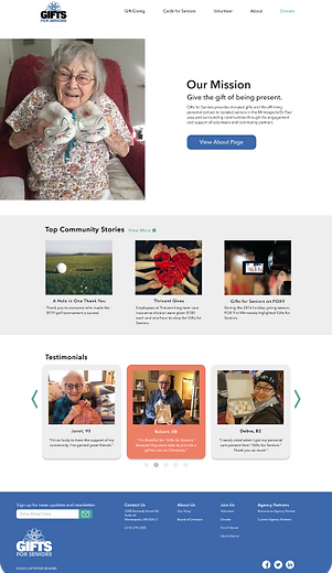
Our final design was greatly informed by the research done early in the project and from the rounds of user testing throughout the design process. The prototype shows a simple, easy to navigate webpage with prominent calls to action. The mission statement is clearly found and the impact of the charity on the community is highlighted right on the homepage. The volunteering page shows multiple ways to get involved right away or sign up for their mailing list to be informed of future events. The donation page shows how to contribute financially or how to find an in-person location to drop off donations.


Prototype Walkthroughs
A quick video highlighting all the different pages of the newly designed website both on desktop and mobile.
Website Prototype
iOS Prototype
Conclusion
The goal of this project was to create a more visually appealing web page for a non-profit charity, Gifts for Seniors.
Our team redesigned a desktop and mobile version of the “Gifts for Seniors” website. I utilized surveys, stakeholder interviews, and user testing methods to lead the UX research aspects of the project. The results from my user research showed the new website design emphasized the positive impact of the organization and made it easy to sign up to volunteer and donate.
A fun anecdote about this project, while this was a case study done for a class project, the executive director was impressed by our ideas and actually implemented many of our suggestions!
If you are interested in more in-depth information about this project or would like to see the full, clickable prototype, please feel free to reach out to me.


Background
Our team was tasked to find a local nonprofit and redesign their website. We had a three week timeline to create web and mobile prototypes.
We chose Gifts for Seniors, an organization that provides gifts and life-affirming personal contact to seniors living in isolation.
Gifts for Seniors
Web & Mobile Redesign
Tools used
Miro
Figma
InVision
Google Forms
Timeline
My Role
UX Researcher
Lead Interviewer
User Flow/Site Map
Wireframe
Prototype
User Testing
3 weeks
The Problem
Our team needed to create a more visually appealing website while focusing on the important work the organization does in the community. Additionally, we needed to create a user-friendly experience for new and current volunteers.
The Solution
We created a website that highlighted the joy and empathy of the seniors who received gifts as a part of the program. The site map of the website was streamlined to make it easier for volunteers to get involved.
Before

After

